€75
X-Cart Menus just got Better
You've asked - and we've Responded... xMenus Responsive (xmR) is the only menu manager available for x-cart to include predefined menu styles with multiple colour options, a menu generator, membership based menus, display filters and a live preview facility (for all devices). Add to this the ability to embed custom HTML and images for all menu items - you now have full control over how your responsive menu will look. xMenus Responsive also provides developers the ability to define their very own custom menu styles... making it the ultimate responsive menu module for x-cart, perfect for beginners and advanced users alike.
Features Include
- Create Responsive Multi-column contextual Menus
- Includes multiple menu themes and colour options view styles »
- Choose from 3 menu presets Dropdown, Flyout & Inpage
- Add, Edit & Move xMenus items, link to any x-cart page type
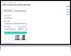
- xMenu Responsive link Wizard/Generator
- In-built Menu & Store Preview facility (all devices)
- Add eye-catching promotional messages, show images anywhere
- Advanced placement options with Display Filters (membership level menus)
It's simple, with xMenus Responsive you control every aspect of your responsive menu - from template styles, destination URLs, single or multi-column configuration and image menu items.
Some xMenus Responsive Interfaces
Checkout some of the xmR interfaces below, our view the the complete feature list here »


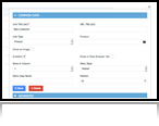
Create Responsive Multi-column contextual Menus

You decide how many columns each of your xMenus (dropdown, flyout or inpage) should contain. Within each column you can assign your xmenu items to any x-cart page type, including home, category, product, manufacturer, free URL and static pages. xMenus Responsive doesn't just restrict you to your category/sub-category links - you can link to anything, absolutely anything, all x-cart page tyles (product, manufacturer, static pages and external URLs.
Many prefefined menu styles to choose from.

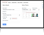
To get you started we have included over 20 different menus styles and colour options. Once you have created your xMenu, the next step is to deploy it, but wait you're not a designer and don't understand CSS all that much, so how are you going to get that perfect look and feel you're after? Well, this is where our pre-defined template themes come into play. We have created 20 styles for you to choose from.
For those of you that want to get a little more adventurous, we have developed xMenus Responsive to extended or customised pretty easily.
Choose from 3 menu presets Dropdown, Flyout & Inpage

With xMenus, you are not restricted to just using 1 menu type - we've created all the necessary Javascript and CSS themes, so you can choose from any of our 3 pre-defined xMenu types, these include: Horiztonal Dropdown menus, Vertical Flyout menus and In-page (link farm) menus - examples of all xMenu menu types can be seen here »
Add, Edit & Move xMenus items, link to any x-cart page type

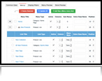
Our new xMenus admin interface comes with some really cool features to allow you to control your menus. Creating menu items within xMenus is a breeze, we have included a neat ajax based interface which allows you to add, edit and move menu items - while also allowing you to change the detination page type for every link. Dynamically change menu items and destination URLs, linking your items to home, category, product, manufacturer, free URL and static pages in a second.
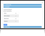
Selective Menu Items per Device

With xMenus Responsive, you can control how every menu item "appears" - but you knew that right? But we have taken it to another level, with xmR you can now choose which devices your menu items appear for. Lets think about this... okay for desktop devices you might want to show a large complex menu structure, this same menu will appear on your users mobile devices, but how about restricting what menus appear on a per "device" level?
With xmR we have done just that, you can choose what devices each of your menu items appear on - including Desktop, Tablet (Landscape), Tablet (Portrait) and Smartphone - allowing you to serve up a more "fine tuned" menu to each device type.
Show links with Images

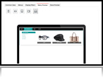
A new features exclusive to xMenus Responsive is the ability to assign an images to any link within your menu. For example, you might want to include a product link into your menu, with xmR you can add that link, plus the product image... and the product price. Bang, what a perfect way to grab your customers attention bu showing an exact product image, with a title (This Weeks Special) and the price - guaranteed to get your customers to that page.
Advanced CSS based templating System

For those of you that like to get dirty with CSS and would like to create your custom xMenus template styles - then we've got just the thing for you... "CSS based template system". xMenus is a highly flexible module, allowing you to define your own CSS styles which are then loaded into your frontend menu system. We have developed some tutorials on how to extend this facility so you can create your own custom styled CSS xMenu system - without a doubt, this is the single most powerful feature of xMenus.
Embed HTML Anywhere - add eye-catching promotional messages

Spice up your xMenus by adding some appropriate promotional messages or banners to the footer of each xMenu. What better way to target your promotional messages by including some eye-catching banners or promotional text with each menu - this way, you are guaranteed that customers will see each special offer you have for that section of your xMenu/store.
In-built Menu & Store "Live" Preview facility

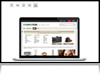
With "Live Preview" features you can see how your new xMenu menu will look on your website before you actually publish it for all devices. Each time you update your xMenu, the "Live Preview" option will reflect all recent changes and display the exact menu sysyem as it will appear online. This feature is essential, for when you intend to build and design a new xMenu giving the oppurtunity to view it on all devices "before" publishing.
Advanced placement options with Display Filters (with memberships)

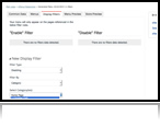
This is a fantastic feature, that's why we left it to last... Following in the steps of our very popular xBanner2 module, we have also included our "Display Filters" facility into our xMenus module. Using "Display Filters" you can decide to show specific xMenus systems on various dedicated pages within your x-cart website, this means you can create specific xMenus that will only appear on certain parts of your site.
For those of you that use the "memberships" features of x-cart, you will know what sometimes you want to show specif menus or offers to your members without other users seeing these offers/menus. Well, with xmR you can do just that. From the admin area you can apply files to only show a spcific menu to one group of users while showing another to all other members - really cool way to offer your members something special, without having to custom program your entire website.
ALL Previous xMenus available
Checkout all the amazing features of xMenus for more of what xMenus Responsive has to offer even more features ».
FREE future upgrades
As with all our templates and modules, all customers are entitled to free upgrades - however in the case of xMenus, we intend to release several CSS based template styles over the coming weeks/months - all of which will be free. Keep in mind, if you are after a particular menu design and you would like our custom development team to create something special just for you, do get in touch and we'll provide you with a quotation.

In this short tutorial, plan to introduce some of the new features of xMenus Responsive, while also takaing a quick look around the new interface. All our previous xMenus videos are still relevant, so do check them out if you need to learn the basics.
xMenus Responsive Live Demo Website

To help demonstrate the power of xMenus Responsive for x-cart, we have installed it on our responsive template "Fashion Walk" demo websites:
xMenus with Fashion Walk »
With the help of xMenus Responsive built-in menu generator, we have created and assigned almost 500 unique URLs within our demo sites - add to this some custom CSS styling then the benefits of xMenus really shine through.

